
Historical Graph
The Historical Graph is where you tend to start your research. This graph is where you view valuations on the company of your choosing utilizing a plethora of different metrics and timeframes to get a better picture of the selected company. The data is displayed in an easy-to-view way, so you can see things like earnings year-over-year growth, dividend payout ratios and growth, and even debt all in one place.
Click here to learn how to change metrics.
FAST Graphs Tutorial: Utilizing The Historical Graph To Analyze A Stock | FAST Graphs
Graph Area
The graphing area allows you to get an instant picture of the selected company, so you don’t have to tediously pore over spreadsheets. With this graph, company health is clearer and quicker to see than ever before. In the graph area, you’ll be able to quickly perform performance calculations, view consensus analysts’ estimates, and easily see actual earnings numbers.
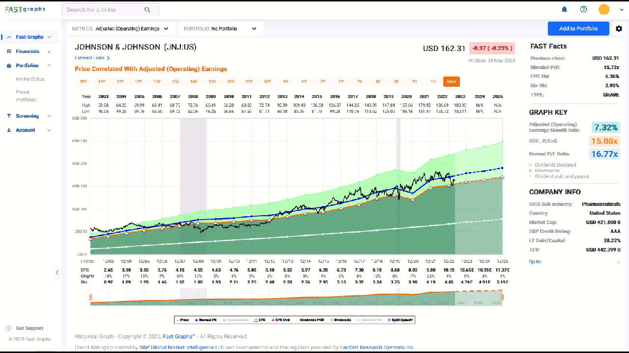
The graphs are color-coded in a specific way to display the data easily and understandable. The black line represents the weekly closing price of the stock you are looking at, with the most recent point (the far right) being the last day’s closing price.

Green Shaded Area
The most important series on the graph is the dark green shaded area. This area represents the earnings of the company and has the color of “money green” just to drive that point home.

Orange Line
In the image above, you’ll notice an orange line sitting on top of the green shaded area. This represents the fair valuation multiple that is applied to the earnings, so you can determine overvaluation and undervaluation in an instant. The valuation ratio drawn is dependent on the growth rate of the company during the selected timeframe. In short, when the black line (stock price) is below the orange line the stock is undervalued, and when it is above the orange line the stock is overvalued.
Click here to learn more about the valuation ratios.
Blue Line
The blue line on the graph represents the Normal P/E of the stock over the timeframe that is selected. This is a trimmed average P/E over the specified timeframe to give you a better understanding of what the market has generally valued the stock price at regardless of the Valuation Ratio. There will be many cases where you will see the blue line above, below, and even exactly the same as the orange line. If the stock price has been generally above the orange line, the blue line will be above too. If the stock price has been generally below the orange line, the blue line will be below as well.

Dividends
If a company pays dividends, FAST Graphs represents them in three different ways:
- There is a Dividend Payout Ratio Line (a honeydew green line that looks white)
- A Dividend Yield Line (a maroon line)
- A light green shaded area above the orange line to represent dividends paid out to shareholders

The Dividend Payout Ratio Line gives you an easy visual that represents the dividend payout ratio according to the selected metric. If the honeydew line is half of the green shaded area, the payout ratio is 50%. You can also hover over any dot on the Dividend Payout Ratio line to view the exact payout ratio for that Fiscal Year in the form of a pop-up. In the case of Johnson & Johnson (JNJ:US) shown below, the line looks almost in the middle of the green shaded area in 2020, and the pop-up shows the payout ratio is 49.6%.

💡 Note: All the data points on the graphs give even more detail when you hover over them!
The Dividend Yield line will show what the dividend yield of the stock was at the specific Fiscal Year that you are looking at. Notice that the yield is higher when the stock price is undervalued, and lower when the stock is overvalued (only more of a reason to invest in companies when they are undervalued!).

The Light Green Shaded Area above the orange line gives you a picture of the percentage of total earnings paid out to the shareholder (payout ratio). It represents the earnings in addition to the dividends paid to shareholders. In the case of Johnson & Johnson (JNJ:US), earnings were $7.30 per share in 2017 (represented by the orange line), and dividends were $3.32 per share. The Light Green Shaded Area represents the earnings per share plus the dividends per share ($7.30 + $3.32), giving a representation of total return (Growth + Dividends).

Estimates
The Historical Graph mostly shows historical data, but we included estimates on the Historical Graph to help give you a better picture of where the company is headed. This area is on the very right side of the graph and is a lighter shade color with dashed lines to help distinguish between historical data and estimate data.

When doing research on how a company may perform in the future, we recommend using the Forecasting Calculators to do the work. The Historical Graph will give a general idea, but the calculators will let you test many theories (including custom theories of your own) in an extremely easy fashion.
Click here to learn more about Forecasting Calculators.
Gray Shaded Areas
Other areas you may notice are the gray shaded areas on the graph. These represent recessions.

Performance Calculations
The Historical Graph also allows you to do performance calculations. First, click on any point on the black line, and then click anywhere on the black line, blue line, or orange line to the right of the initial point to perform a performance calculation. This will give you a pop-up showing you the return on an investment over that specific time, breaking it down and essentially giving you annualized performance. To remove the pop-ups, simply click either the beginning point or ending point on the red line. To get rid of the pop-ups, simply left click one of the small red dots at either the beginning of the red line or the end of the red line.

💡 Notice this is using the default $10,000 investment. Click here to learn how to change investment amounts.
Changing Timeframes
Changing the timeframe is extremely easy with FAST Graphs. You’ll have two ways to do this; with the orange bars above the graphs, and the slider at the bottom. These methods will allow you to quickly analyze a company utilizing up to 20 years of historical numbers. Each timeframe you look at causes the Fair Value line (orange) and the Normal Multiple lines (blue) to be recalculated for that specific timeframe to give you a better understanding of valuation during those periods. These numbers are displayed in the FAST FACTS.
The orange bars make it easy to quickly change the timeframe ranging from 1 year to 20 years. The slider is also an easy way to change timeframes but gives you a more custom range selection so you can look at different snapshots of the company. Simply click and grab either end of the slider and move it where you want.
Buy and Sell Dots
When looking at a portfolio you can easily plot your Buys and Sells on the graph, so you can easily see the performance. The Buys will show up as green dots, and the Sells will show up as red dots. Whatever Buys and Sells you input into your portfolio for each stock will display on the Historical Graph, along with the calculated Average Cost you have in the stock.

Click here to learn more about adding Buys and Sells into a portfolio.
FAST FACTS
The FAST FACTS are located to the right of the graphs and provide highlights of the stock you’re looking at. Here you’ll find important company information like Total Enterprise Value, important stock information like the FAST Graphs Blended P/E, and Compound Annual Growth for the timeframe selected.
There are three sections in the FAST FACTS:
- Current Stock Information
- Graph Key: the numbers in the color-coded section can and will change every time you change timeframes
- Company Information

Stock Information
The Stock Information section of FAST FACTS shows relevant information regarding the stock. In this section you will find:
- Close date of the last trading day
- Closing price on the last trading day
- Share type
- Blended P/E (or whatever metric you are looking at)
- Blended Metric Yield
- Dividend Yield
Click here to learn more about the Blended P/E
This section does not update when you change timeframes.
Graph Key
The Graph Key (color-coded section) gives you information on the graph itself and will update when you change timeframes (this is the only FAST FACTS section that updates when you change timeframes). In this section, you will find what the colors represent on the graphs, but more importantly:
- The Compound Annual Growth Rate of the selected metric during the chosen timeframe
- The Normal P/E of stock during the chosen timeframe
- The Fair Value Ratio applied to the orange line based on the growth of the company
- The custom valuation ratio that you have applied (this is optional)
Click here to learn how to apply the custom valuation multiple.
Company Information
The Company Information section gives a snapshot of relevant company information. In this section, you will find important stats like:
- GICS Subsector
- Country
- Market Cap
- S&P Credit Rating
- LT Debt to Capital
- Total Enterprise Value (TEV)
- Splits/Spinoffs
This section does not update when you change timeframes.
Your Buys and Sells will also be depicted in the Transactions Tab and will even show you the amount of money you have at risk.
Click here to learn more about adding your buy and sell transactions.
Adding and Removing Series
All of the data series on the Historical, Forecasting and Analyst Scorecard graphs are removable. To do so, simply click the series in the Series Key located below the graphs to add or remove the series giving you a more customizable view of what you want to see.

Sliders
FAST Graphs provides Sliders at the bottom of the Historical Graph and Performance Chart for users to target a specific timeframe. You can use the right slider and move to the left to take out all the estimates (E) and get pure historical data.

External Links
External Links are a dropdown and give you direct access to outside research on the selected stock. The external links available are:
- Corporate Website
- Edgar Search
- Morningstar Quote
- Google Finance
- WSJ Quote
- Bloomberg Quote
- Seeking Alpha Research
- Yahoo Estimates

FAST Graphs Tutorial: Features Available On The Historical Graph | FAST Graphs
Updated 2 months ago