Health Check
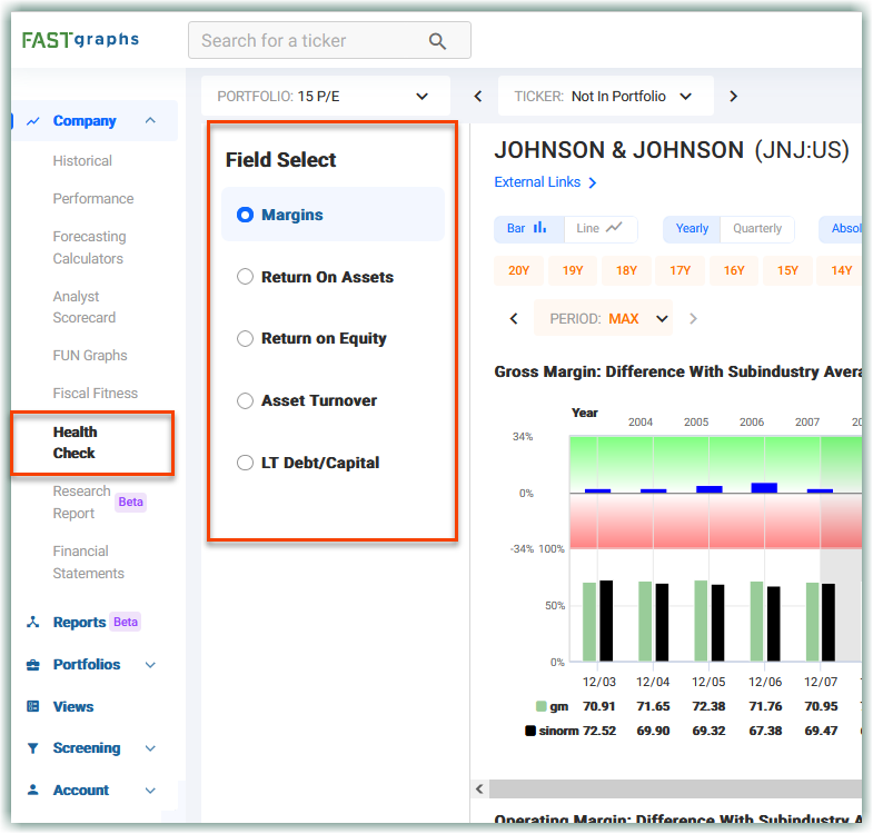
Health Check is a feature found under Financials that assists you in visualizing the overall health of the company. This is done by comparing a few important metrics to the subindustry standard. Please keep in mind that this is not the ultimatum for determining if a company is healthy or not, but instead gives you another picture of how a company compares to others in its subindustry.
Health Check is accessed by clicking on the menu item and is only available to Premium Subscribers or users using the Free Trial Portfolio.

Currently, the list of available metrics in Health Check are:
- Margins
- Return on Assets
- Return on Equity
- Asset Turnover
- LT Debt/Capital
Under the Margins metric, you’ll find three sets of graphs, gross margin, operating margin, and net margin each containing a stacked chart. The top of the stacked chart is the health scoring system. It represents the percent difference between the selected metric and subindustry average. The range of the Health Check is 34% above and below the average, roughly representing 1 standard deviation. The green area represents when the company has performed better than the subindustry average, and the red area represents being worse than the subindustry average.
In short, the longer the bar is, the better or worse the company performed compared to the average, while the smaller bars show the company performed close to the average.
While the top of the stacked chart represents the percent difference, the bottom of the stacked chart displays the actual values of the company and the subindustry per year.
The remaining metrics have two charts each. On top, they have the stacked chart representing the same relationship as the margins. The bottom chart contains the two associated metrics that are used to calculate the Health Check metric. For example, Return on Assets is calculated by dividing net income by total assets. This graph below shows those two items graphed to give a better understanding of how ROA is changing on a year-to-year basis.
The final point to notice is that above the subindustry average does not always necessarily mean a good thing. This is the case of LT Debt/Capital. For this metric, notice the green and red are swapped – red is on top and green is on bottom. Since this represents leverage, it is considered better for a company to be below the subindustry average, meaning it has less debt than its competitors.
Updated 2 months ago