
FUN Graphs
FUN stands for Financial Underlying Numbers and give you a deeper look into each company. With FUN Graphs, you’ll be able to quickly analyze important financial statement items as a per-share function or in millions. You’ll also be able to view important financial ratios such as liquidity ratios and profitability ratios.
FUN Graphs is accessed by clicking on the menu item and is only available to Premium Subscribers

In this section, you’ll learn more about the following:
- General Graph and Navigation
- Selecting Yearly or Quarterly Graphs
- Selecting Line or Bar Graphs and Arithmetic or Logarithmic Graphs
Changing Graphs
There are 3 graphs available in FUN Graphs:
- Per Share
- In Millions
- Ratios

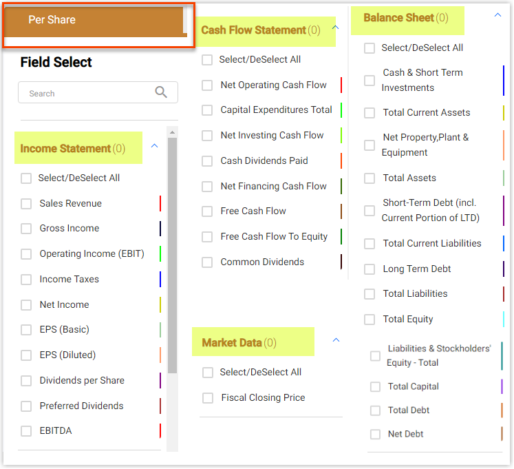
Per Share Graph
The Per Share Graph (the Brown Graph) is the default graph that is drawn when accessing FUN Graphs. This graph displays data from the balance sheet, income statement and cash flow statement of the stock all in per share numbers. Any and all of the items under the dropdown menu to the left of the graph can be plotted at any time by clicking the checkbox next to the corresponding item.
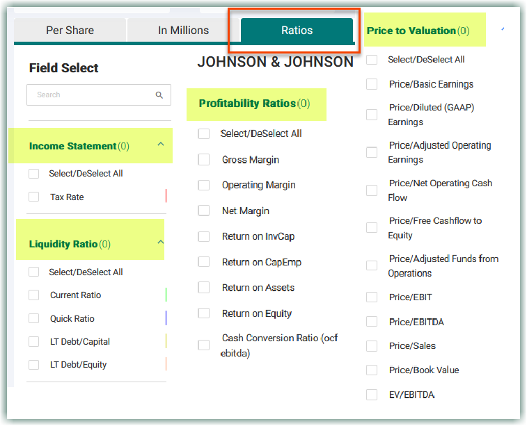
Ratios Graph
The Ratios Graph (the Green Graph) displays liquidity ratios such the Quick and Current Ratios, and valuation ratios.
In Millions Graph
The In Millions Graph (the Red Graph) displays everything that the Per Share Graph (the Brown Graph) shows, but in millions instead of per share amounts.

The graphs are relatively simple, but they are designed to help you quickly see company performance and health without needlessly cluttering your screen. They all show up to 20 years of historical data or up to the last 8 quarters, and are all designed with the same dropdown menu system to the left of the graph area. Below the graph are data points that give you more information on the graphs. These data points display:
- The date
- The corresponding data points
- Compound growth per year
- Average Growth over the selected timeframe
- Compound Average Growth (CAGR) over the selected timeframe
At any point, you can switch easily between the 3 graphs by clicking on the tabs above the graph area, and below the ticker search bar. Each of these 3 graphs displays different information to help you analyze a company quicker and more in-depth.
Selecting Graph Items
Selecting items to populate the graph is done so in the drop-downs to the left of the graph area. Each bar is an expandable column and gives you a plethora of options to choose from so you can perform your own comparative analysis between items.

Selecting Yearly or Quarterly Graphs
It is extremely easy to switch between Yearly and Quarterly Graphs. Simply click on the tab and the graphs will instantly redraw with the corresponding data.

The Yearly graphs show up to 20 years of data, and the Quarterly graphs show up to 20 quarters. You also have the option to look at FUN Graphs as bar graphs or line graphs, coupled with arithmetic or logarithmic graphs. To do so, click on the icons located above the graph, and the graph will instantly redraw.
Absolute/Growth
Absolute shows the actual value per year and the compound annual growth rate for the selected timeframe.

The Growth tab shows the growth rates per year and the average growth rate for the selected timeframe.

Updated 2 months ago